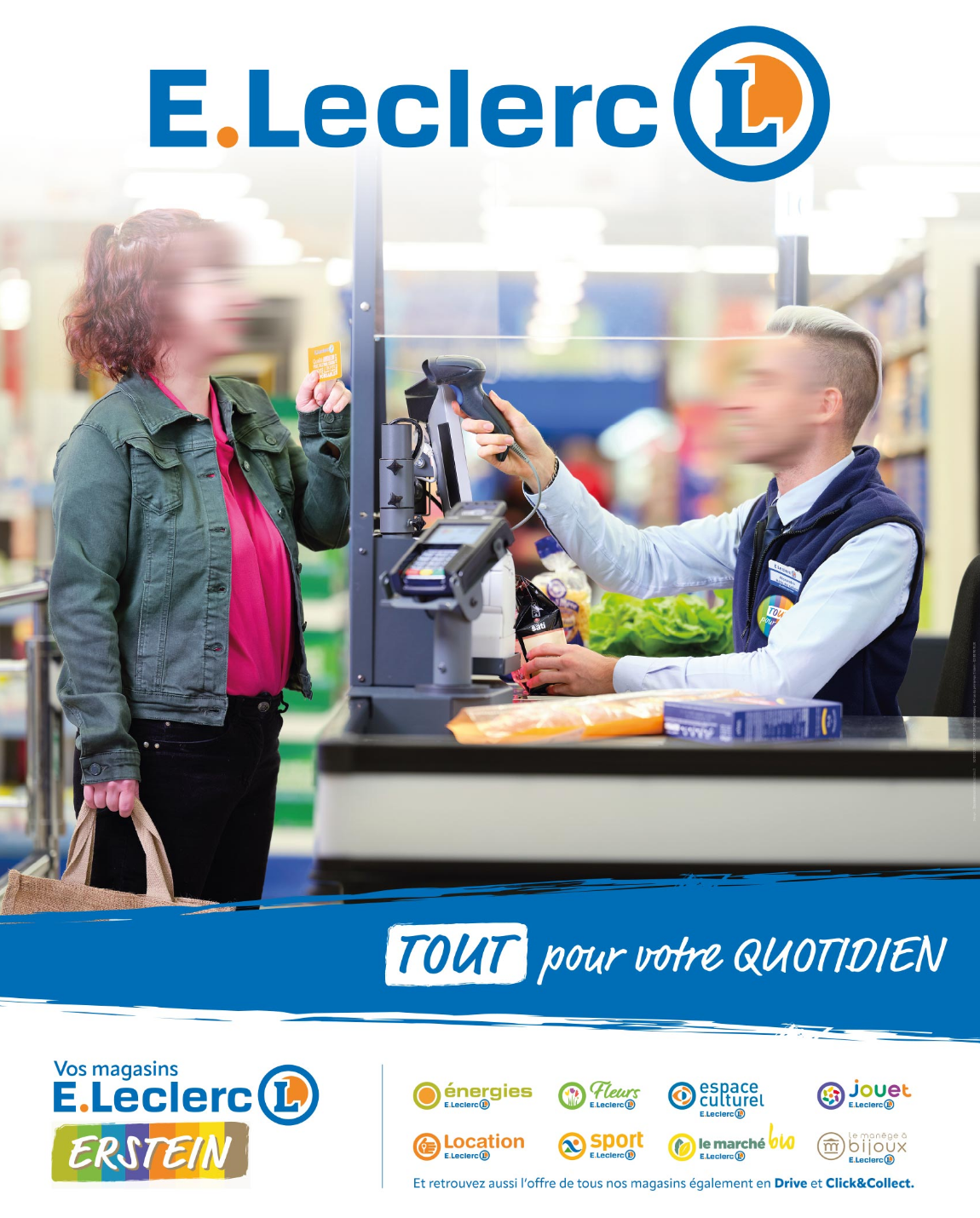
E.Leclerc Erstein.
Identity and communication for E.Leclerc stores in Erstein.
The client commissioned us to develop a unique identity for its E.Leclerc stores and dedicated communication with the aim of making a strong local promise to its customers: to give a unifying signature to the daily commitment of the teams and all the work that is done to do everything for the customer.
To do this, we immersed ourselves for a long time in the daily lives of the more than 300 people who work in several stores, with the aim of translating what makes the difference and giving it substance and form to share.
work carried out
Brand strategy
Brand experience
Branding
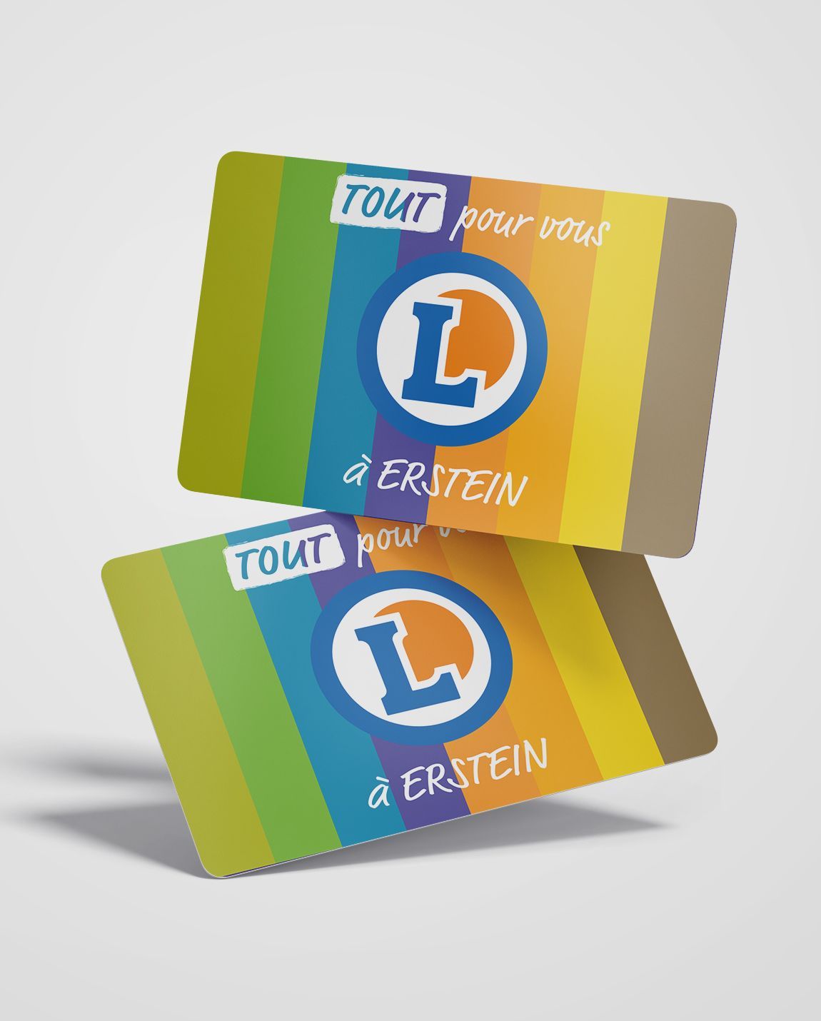
Print communication
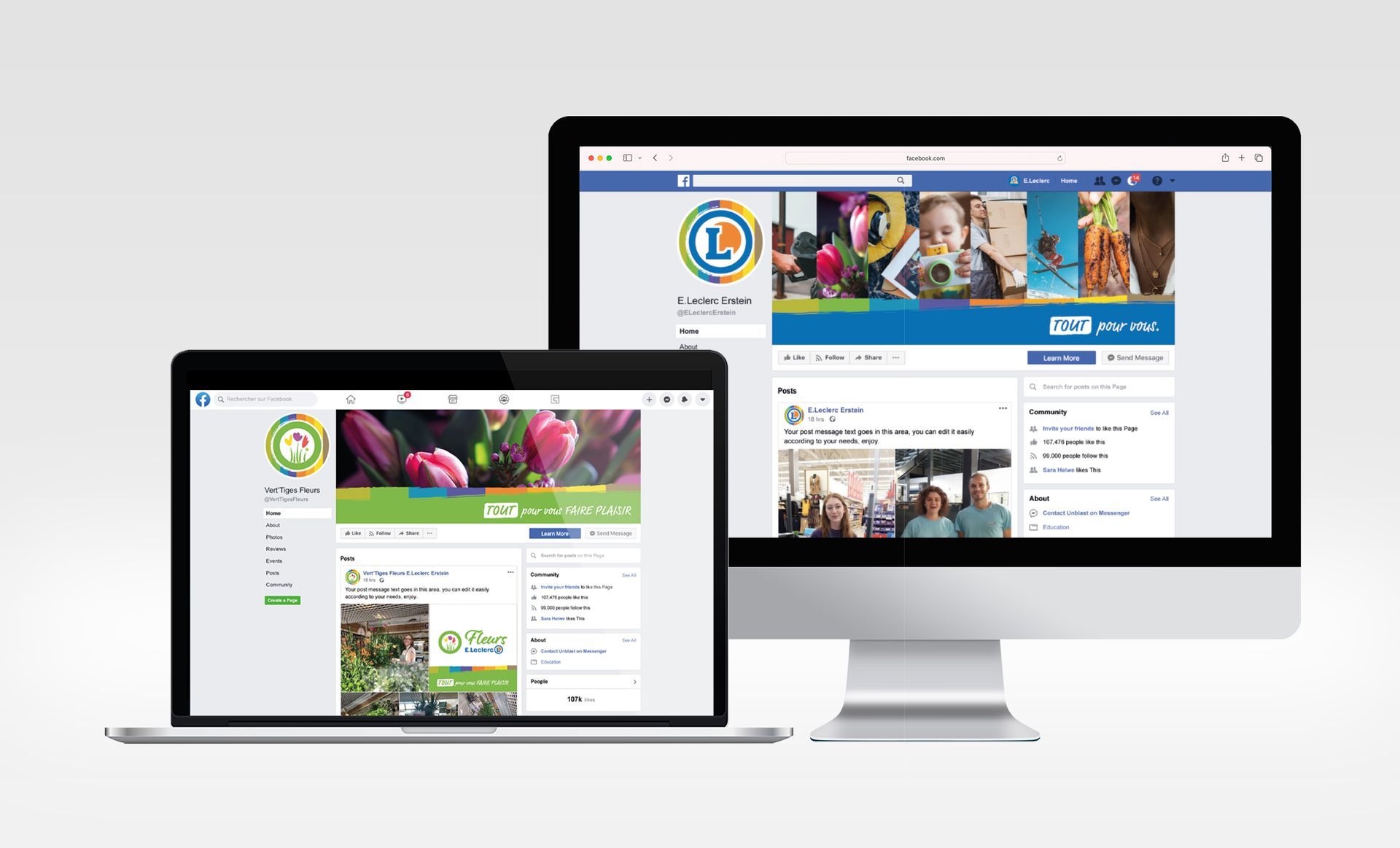
Digital communication

More experience design?