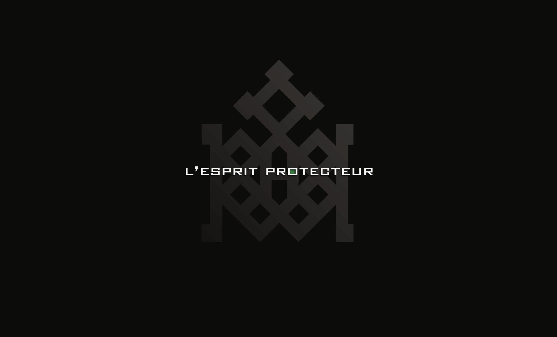
Hogoon security.
Creation of a brand based on the symbolism of protective rituals.
The vision: to become the leader in premium global protection solutions for French companies (health risks, fire, anti-social behaviour, break-ins, theft, cyber attacks, etc.).
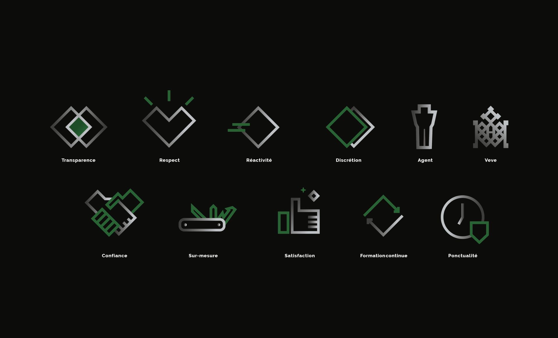
Our approach: Design the brand around powerful symbols to convey the brand territory imagined around the concept of "the protective spirit".
A beautiful project carried out in close collaboration with and discovery of the culture of the company's founder.
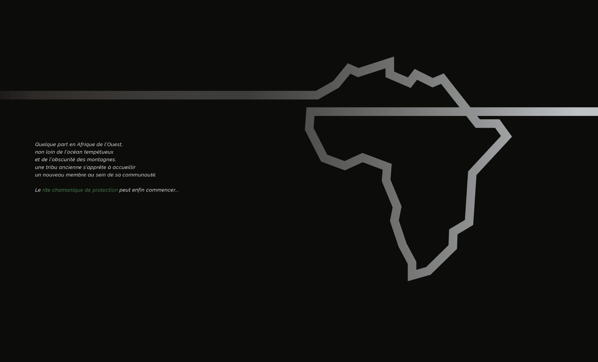
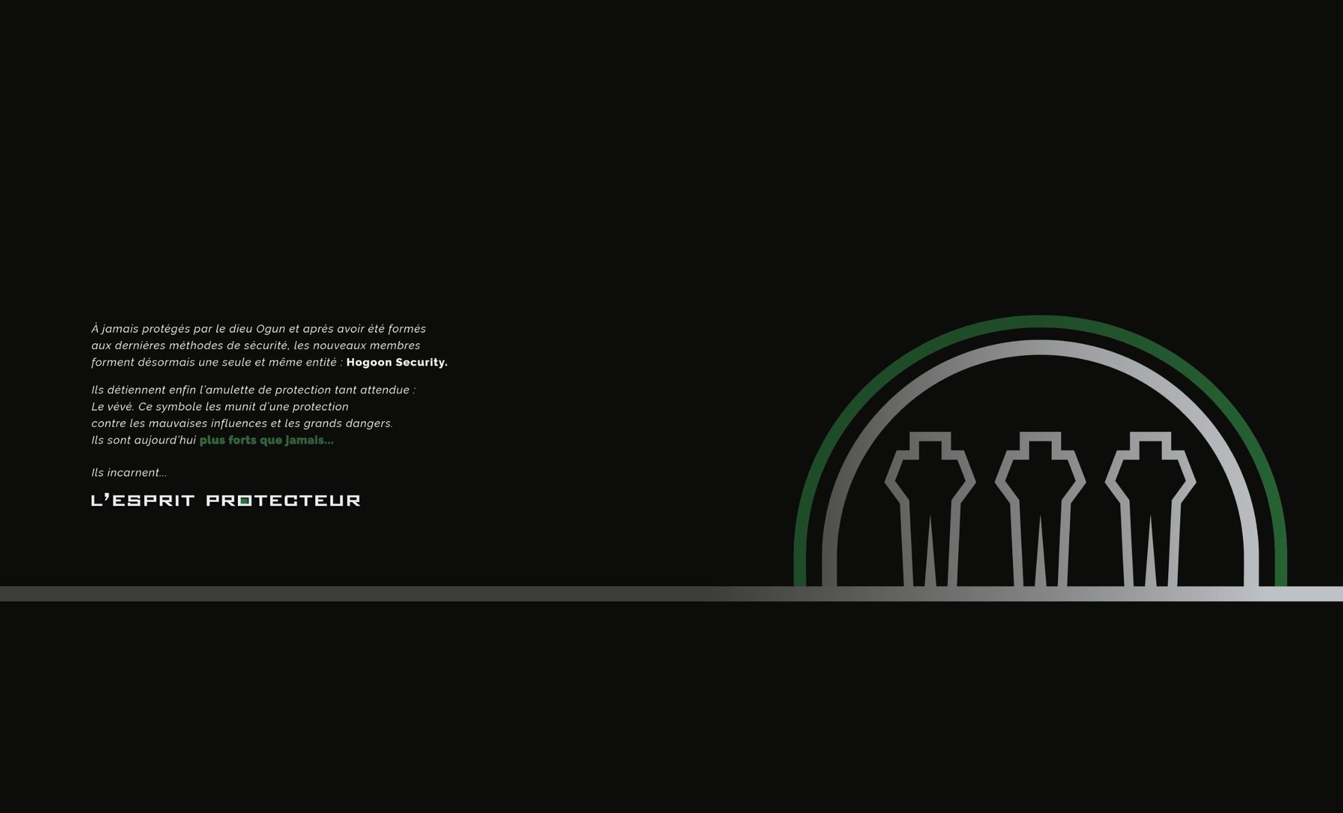
A unique and authentic story.
work carried out
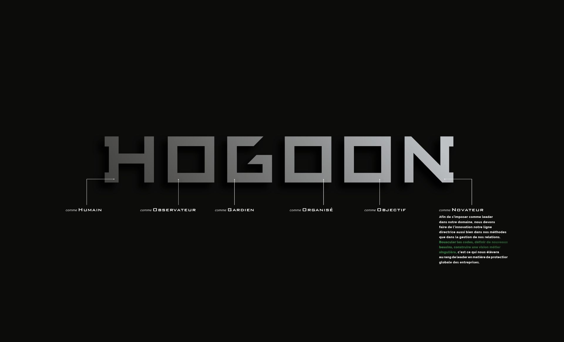
Brand DNA
Consulting and Strategy
Storytelling
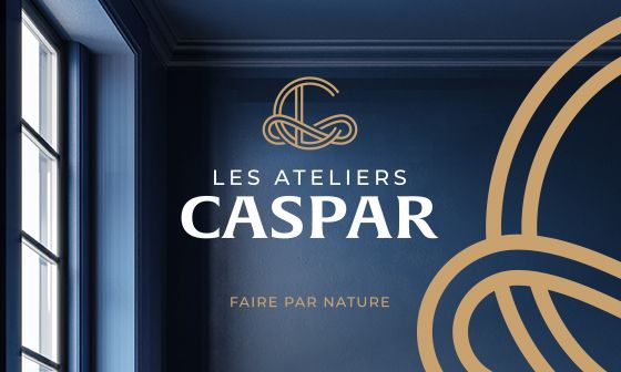
Branding / Identity
Tools
More brand design?