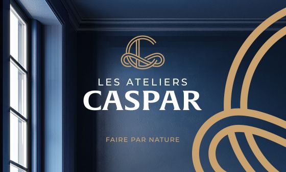
NaturaHome.

Comprehensive brand creation: from platform to visual identity.

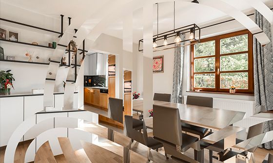
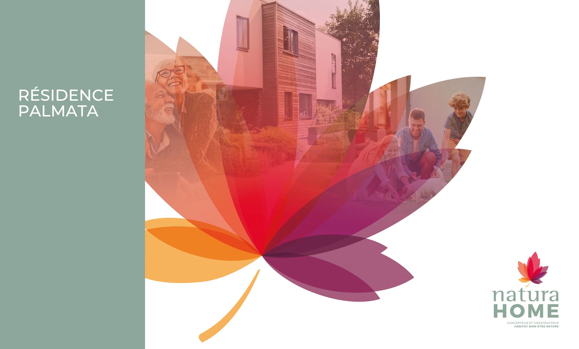
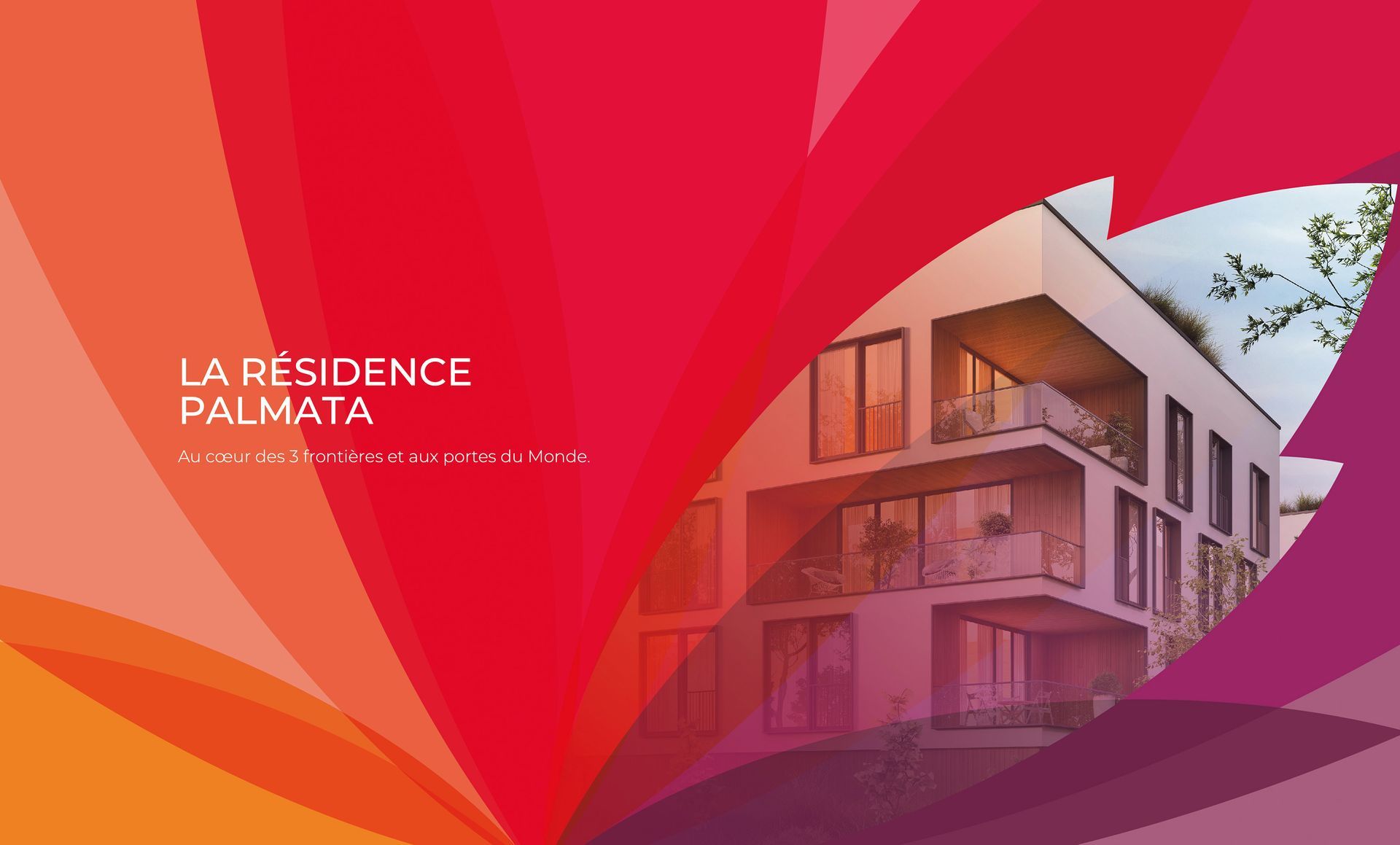
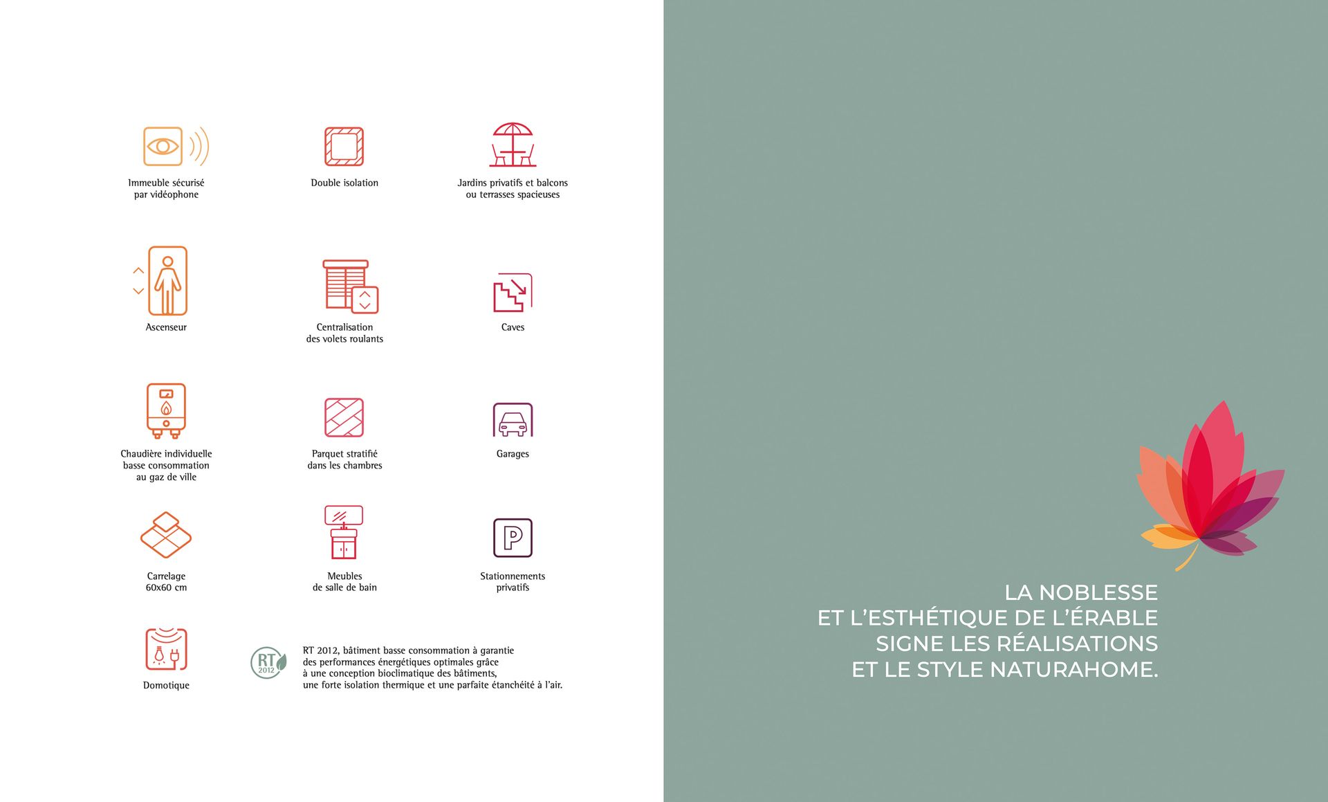
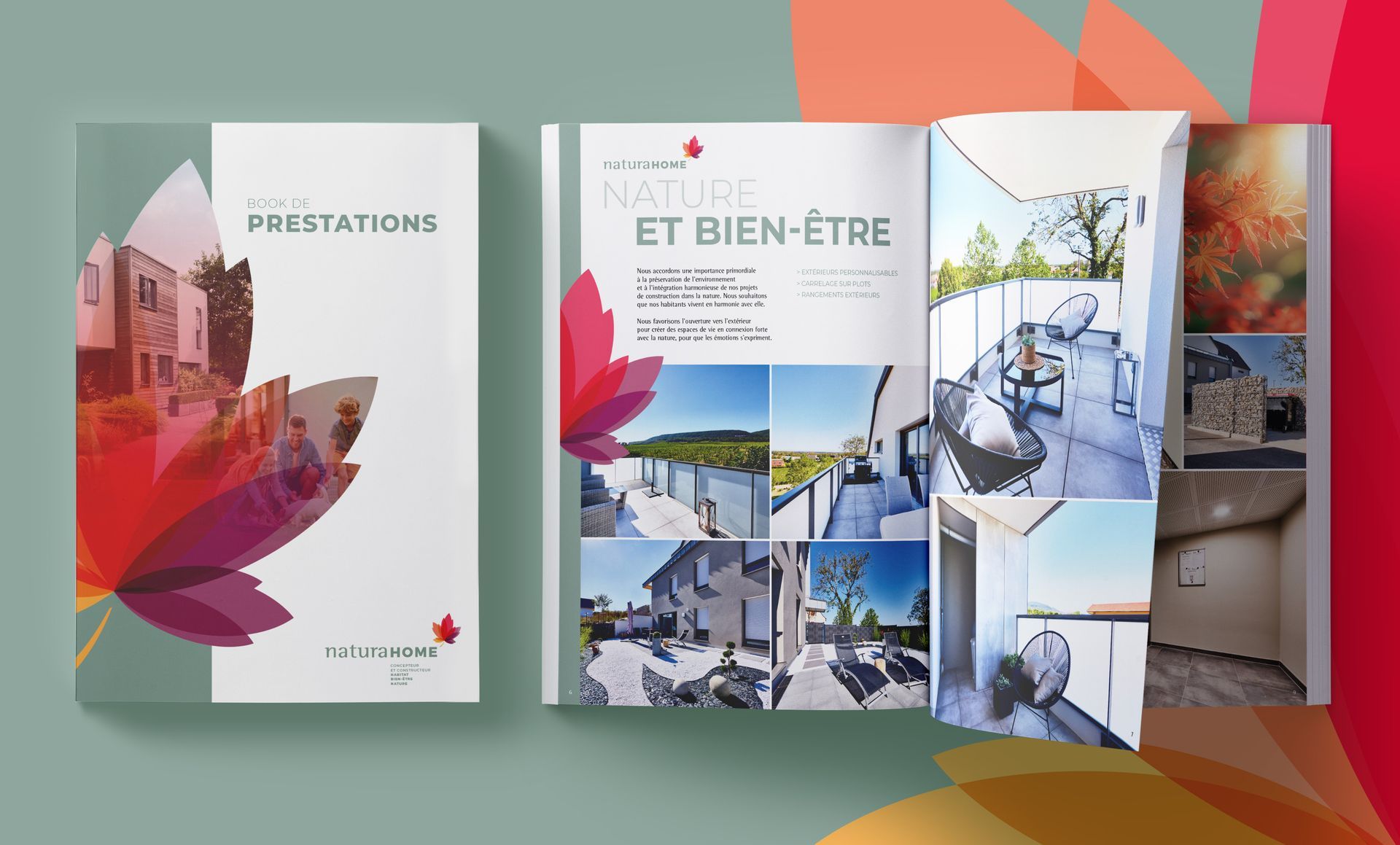
From the outset, the founder of this brand wanted to offer different types of homes, inspired by a very demanding personal experience: creating wellness homes in natural, green settings. 
The idea: when I'm indoors, I feel better if daylight floods my interior and if the view outside makes me happy.

From this powerful idea, the Naturahome brand was born, which we wrote, expressed, translated and created in its entirety in close collaboration with a client who is passionate about his work.

work carried out

Consulting
Brand platform
Brand territory
Visual identity/branding
Artistic direction
Prospect experience design
Communication
Tools

Logo for
Abstract floral design in gradient hues of red, orange, and purple.
Brochure promoting

The choice of the maple tree as the brand's symbolic figure.
A symbol of independence and freedom, but also of style.
Meditating under this tree would reinvigorate minds weary from the many trials of life.
The maple tree displays all its colours throughout the seasons. 
Colours, softness, harmony, balance...

The choice of the maple tree as the brand's symbol. A symbol of independence and freedom, but also of style. Meditating under this tree would revitalize spirits weary from life's many trials. The maple displays all its hues throughout the seasons. Colors, gentleness, harmony, balance…

La Résidence Pal Mata brochure. Modern building with balconies, orange and purple abstract background.
Icons in orange/red on white, leaf design on green, with text.
Text
Billboard for Campestra apartments, featuring building rendering and contact info: 03 89 782 054.
Book cover and open pages displaying real estate images and text, with a fall leaf graphic.

More brand design?

Logo for
Hand reaching up, cast shadow on wall with striped light. White logo
Collection of faces making silly expressions; central giraffe image. Yellow logo says
Dark blue background.