Daniel Stoffel identity.

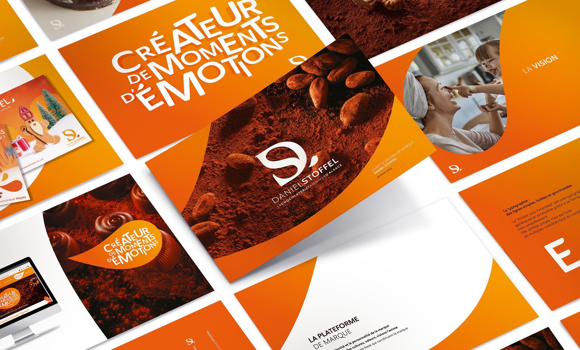
A new identity for the Alsatian family chocolate factory.

The Daniel Stoffel chocolate factory entrusted us with the task of supporting the redesign and marketing repositioning of their brand.
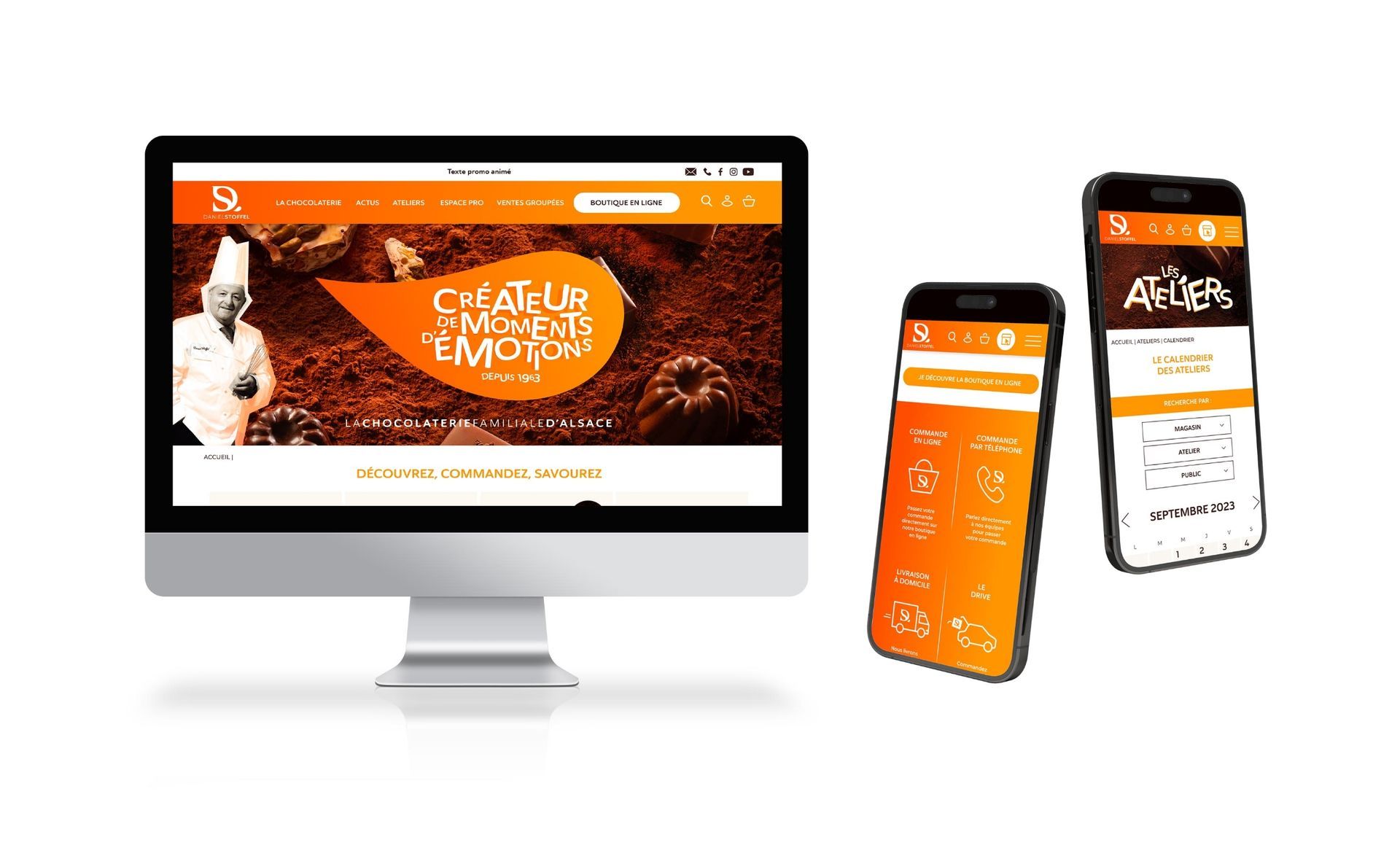
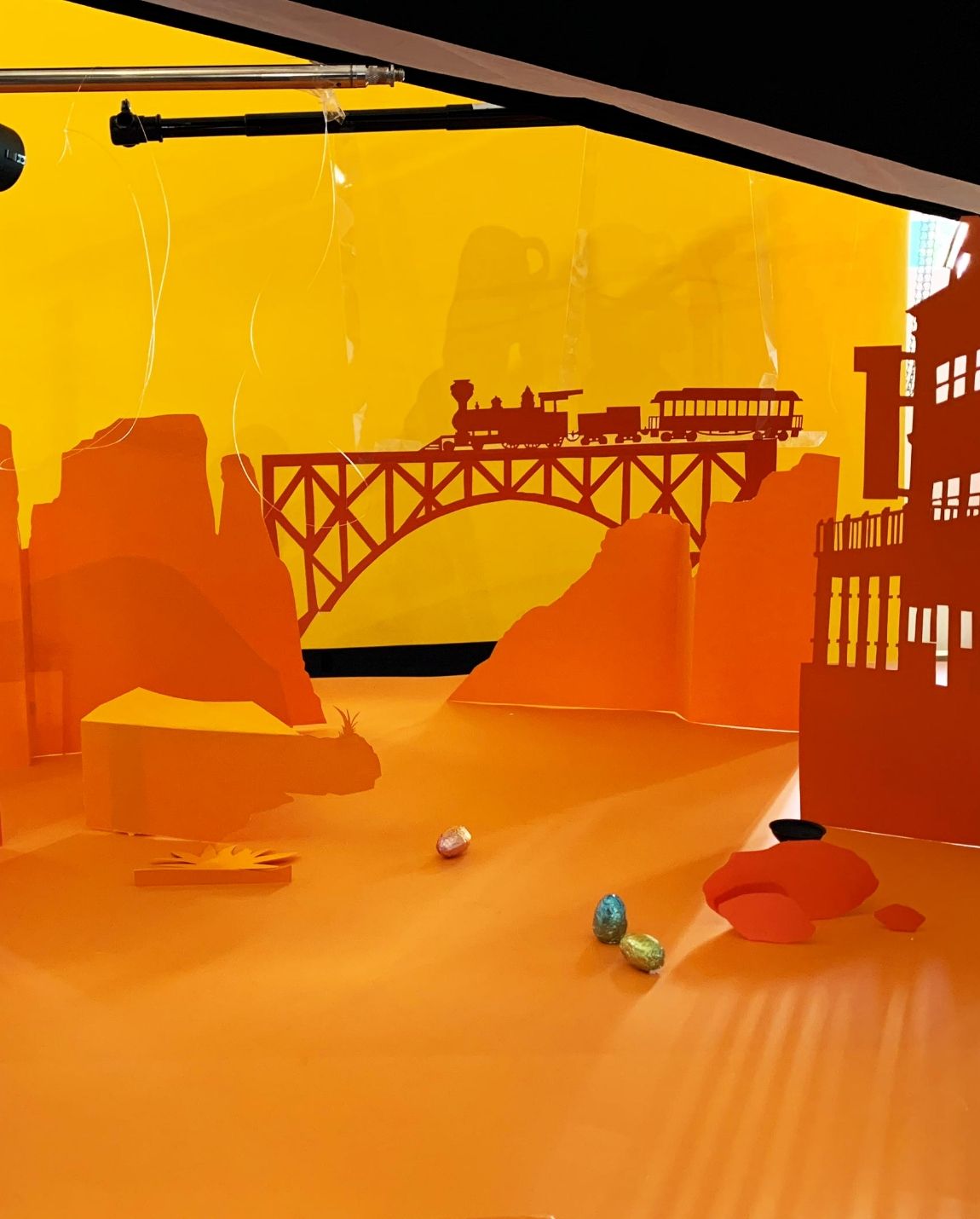
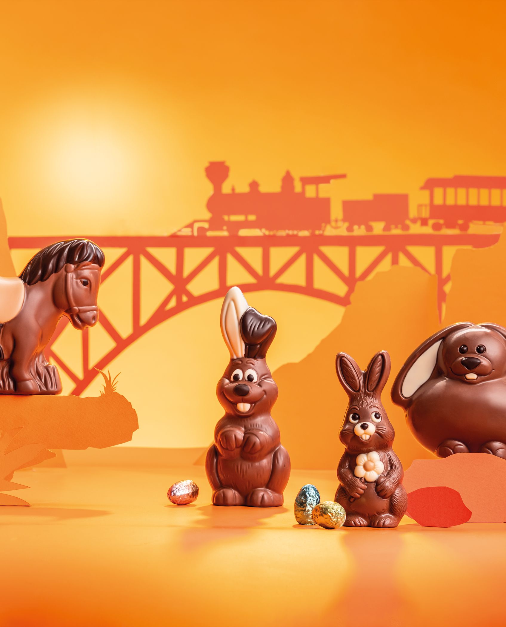
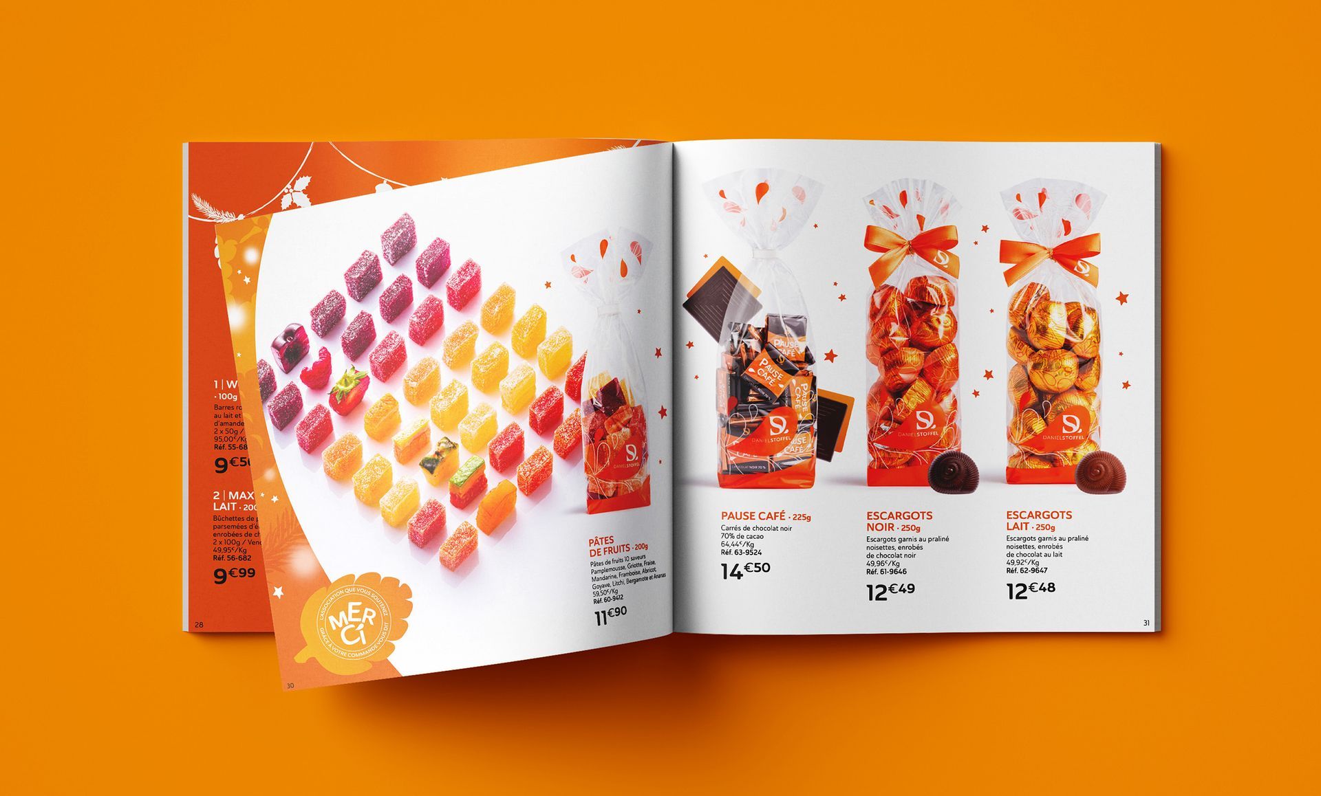
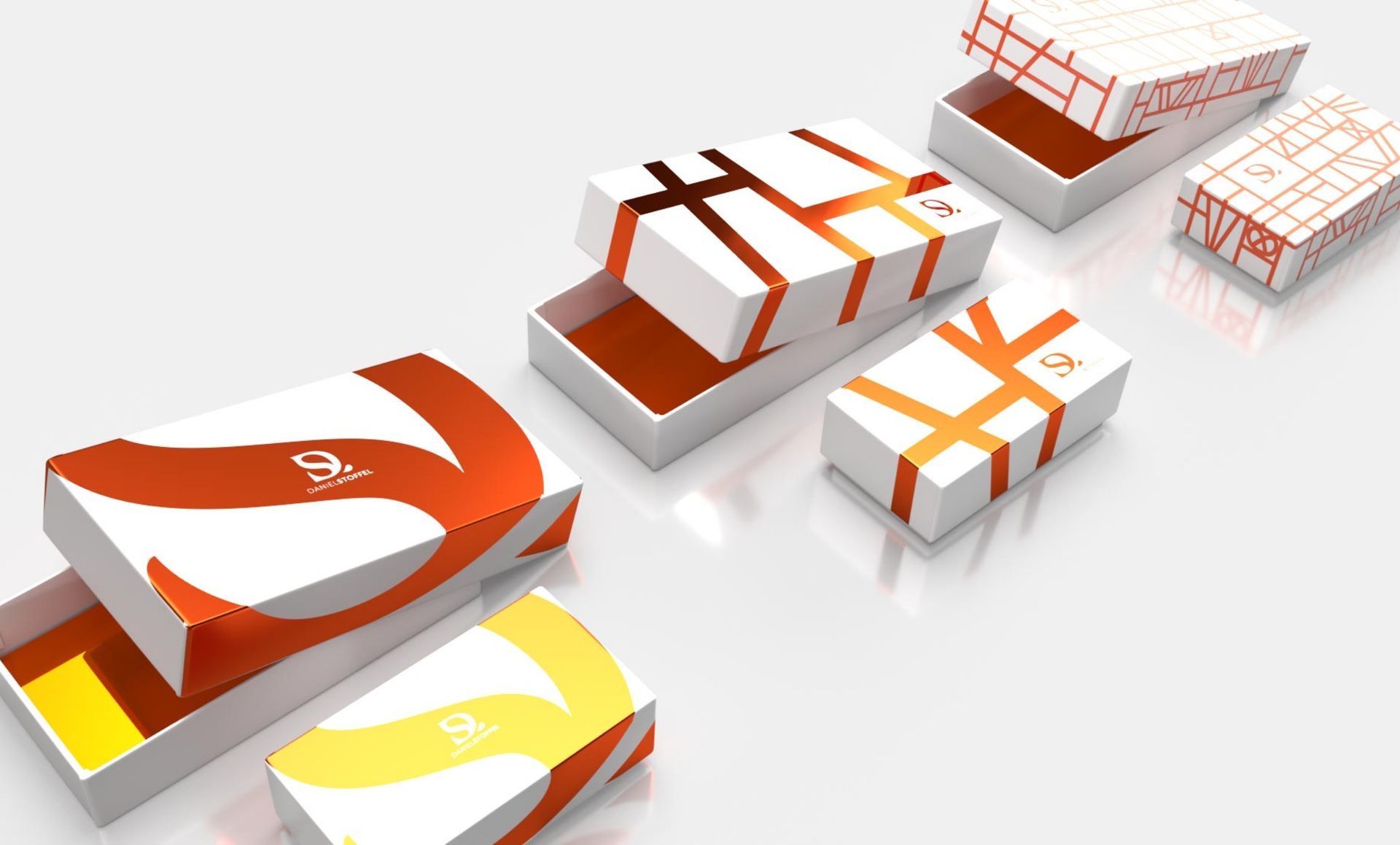
The programme included advice on brand strategy, new artistic direction, creating an immersive and fun customer experience, a new brand identity, a complete redesign of the packaging, innovation, new products, redesign of existing stores and creation of a flagship store, digital communication, e-commerce, etc.

work carried out

Consulting / Strategy

Brand Territory and Platform

Brand Content

Art Direction

Branding

Communication

Photoshoot Direction / Styling

Orange and white brochures with text and images, featuring a chocolate theme and people.
Desktop and mobile screens displaying a website with an orange and white color scheme.

An in-depth effort to accurately convey the appealing facets and countless qualities of this incredible family business.
A close-knit team effort with an exceptionally dynamic leader and a passionate team.

Common because aligned, Common because identical, Common because gathered, Common because unified. The acronym created evokes a symbol of communion, sharing, listening, and empathy. Humans are sensitive beings who live, feel, touch… Experiencing beauty and resonating with the same spaces and objects instantly brings us closer.

A western-themed marble run with a train crossing a bridge. Orange and yellow hues dominate the scene.
Chocolate bunnies and a horse figurine with wrapped Easter eggs, orange backdrop with train on bridge.
Open book with candy and popcorn on orange background.
White boxes with orange ribbon designs, on a white surface.

More brand design?

Solid background, muted green color.
Collection of faces making silly expressions; central giraffe image. Yellow logo says
Text on red background: